Achieve a Cohesive Bathroom with Burdens Bathrooms
Creating a cohesive bathroom look can feel overwhelming, especially when you want your tapware, vanities, tiles, and benchtops to harmonise seamlessly. The key lies in thoughtful coordination—selecting finishes, styles, and textures that complement one another rather than clash. Whether you’re undertaking a full bathroom renovation or just upgrading a few fixtures, understanding how to match tapware with your surfaces can transform your space from functional to fabulous.
In this guide, we’ll walk you through strategies for coordinating tapware and surfaces, highlight popular trends, and showcase Burdens Bathrooms’ premium collections to help you achieve a polished, unified look.
Understanding Tapware Finishes
Tapware is more than a functional element; it’s a design statement. The finish you choose can set the tone for your entire bathroom. Here are some popular finishes and how they pair with different surfaces:
-
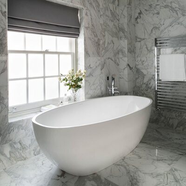
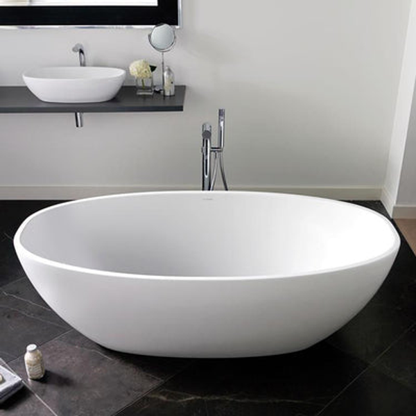
Chrome: Classic and versatile, chrome works well with almost any surface. Its reflective quality complements glossy tiles and modern stone benchtops. Chrome tapware pairs beautifully with neutral colour palettes and is ideal for contemporary or minimalist designs.
-
Brushed Nickel: A softer, muted finish that hides fingerprints and water spots. Brushed nickel pairs well with warm-toned vanities, wooden accents, and matte tiles.
-
Matte Black: Bold and modern, matte black tapware makes a strong statement, particularly when contrasted with light surfaces. Pair it with white or grey tiles for a striking monochrome look.
-
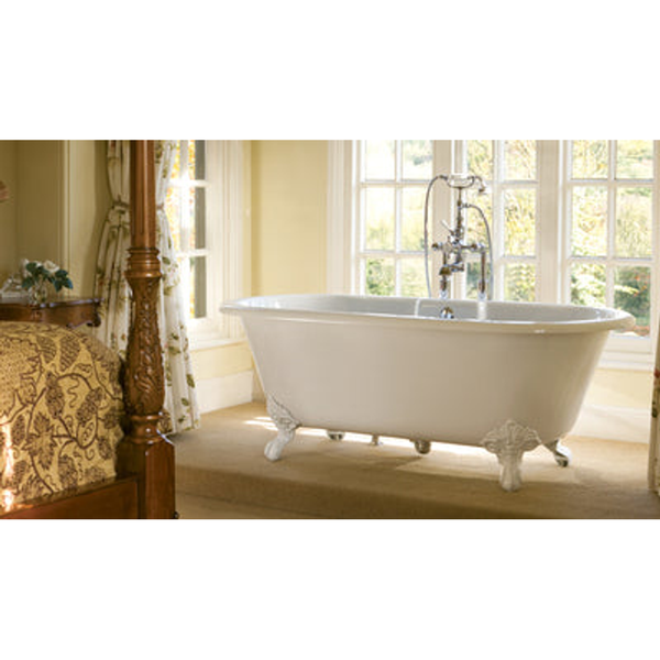
Polished Brass & Gold: Luxurious and eye-catching, these finishes bring warmth and elegance. They work beautifully with natural stone, marble, or darker timber finishes for a classic or vintage-inspired aesthetic.
At Burdens Bathrooms, the tapware collection features a wide range of finishes, allowing you to mix and match with your preferred surfaces effortlessly.
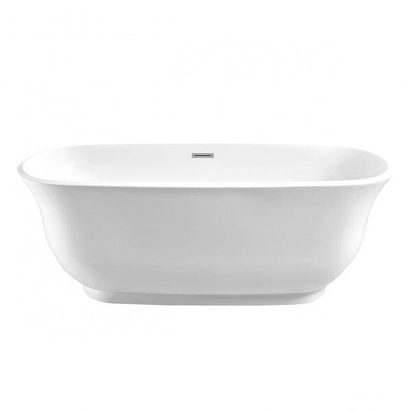
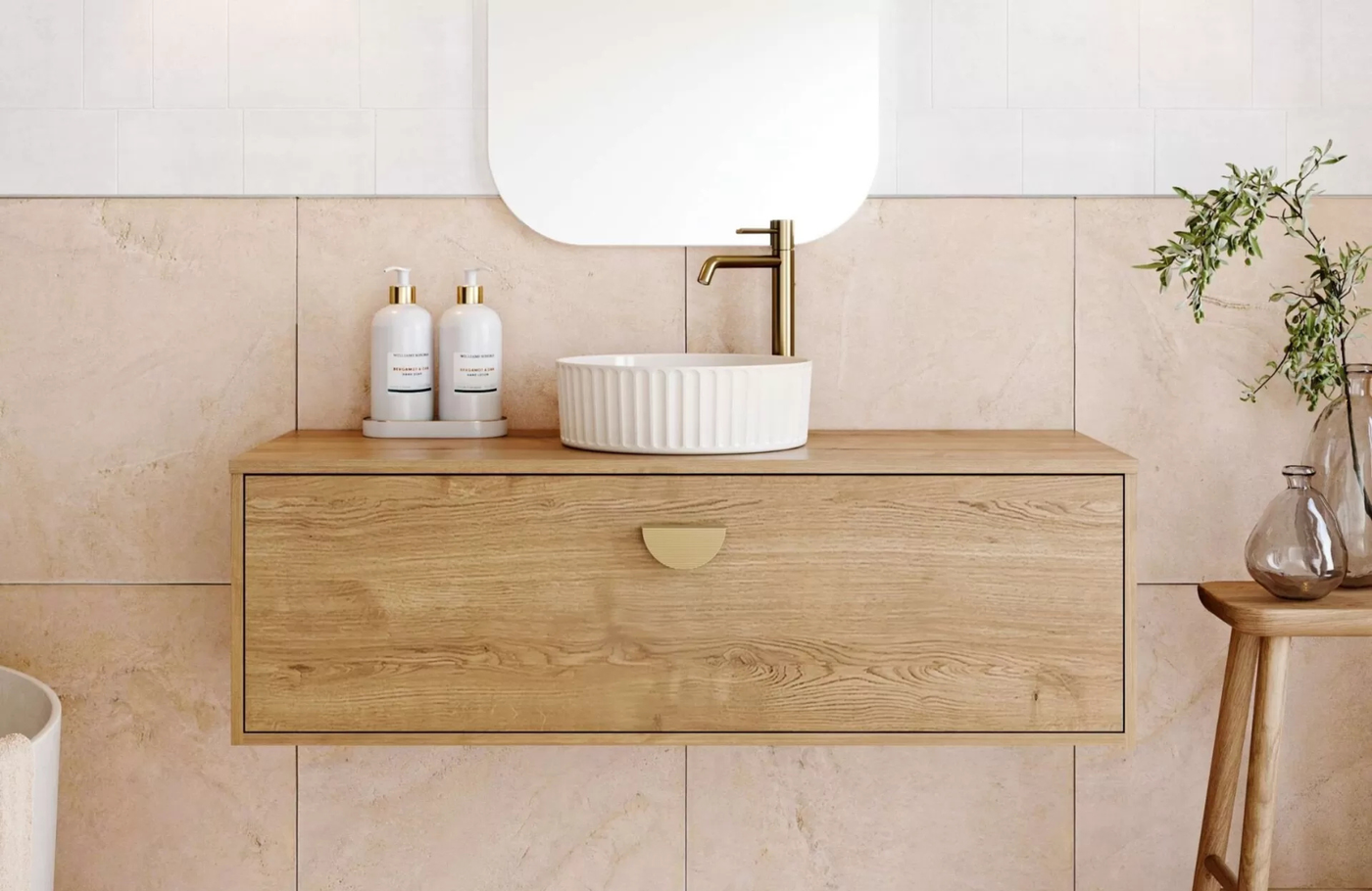
Coordinating Tapware with Vanity Surfaces
Your vanity is often the focal point of your bathroom, so it’s important that your tapware complements it. Here’s how to make the perfect match:
-
Match the Tone: If your vanity has warm wood tones, consider warm metallic finishes like brushed nickel or brass for your tapware. For cooler tones like grey or white stone, chrome or matte black can create a sleek, modern look.
-
Complement the Texture: Glossy vanities pair well with polished finishes, while matte or textured surfaces suit brushed or matte tapware.
-
Size and Scale: Ensure your tapware is proportionate to your vanity basin. A large basin can handle taller, statement taps, while a smaller basin benefits from more streamlined fixtures.
Check out Burdens Bathrooms’ vanities collection for options that pair beautifully with a variety of tapware styles.
Coordinating Tapware with Tiles and Benchtops
Tiles and benchtops are critical to your bathroom’s overall style. Here’s how to coordinate your tapware effectively:
-
Neutral Tiles: Neutral colours like white, beige, or grey give you flexibility. Chrome or brushed nickel tapware can blend in seamlessly, while matte black or gold finishes create a bold contrast.
-
Patterned or Textured Tiles: When your tiles are patterned or highly textured, consider more understated tapware to prevent visual overload. Polished or matte finishes in neutral shades usually work best.
-
Stone or Marble Benchtops: For luxurious surfaces, consider tapware with a metallic or matte finish to complement the stone’s natural veining. Polished brass or gold adds a touch of opulence, while black or chrome maintains modern elegance.
Burdens Bathrooms’ tiles and benchtops collection offers premium options that work harmoniously with a wide range of tapware finishes.
Mixing Finishes Without Clashing
While matching finishes is a common approach, mixing finishes can create a designer look when done thoughtfully:
-
Two-Metal Trend: Pairing two metallic finishes, like chrome with brass, can add depth and interest. Keep one finish dominant to avoid a chaotic look.
-
Accent Pieces: Use your tapware as a feature. For example, matte black taps can become a statement against neutral tiles and a white vanity.
-
Consistency in Style: Even if finishes differ, maintaining consistency in style (modern, classic, industrial) ensures the space still feels cohesive.
For inspiration, the Burdens Bathrooms blog features articles on mixing finishes and current tapware trends.
Considering Function and Placement
A cohesive look isn’t just about aesthetics; function matters too:
-
Wall-Mounted vs. Basin-Mounted: Wall-mounted taps work well with minimalist vanities, while basin-mounted taps suit traditional or freestanding vanities.
-
Single vs. Double Tapware: Consider symmetry and usability, especially for double vanities or larger basins.
-
Height and Reach: Ensure your tapware height and spout reach complement the basin depth and size to avoid splashing and discomfort.
Burdens Bathrooms’ tapware guides offer detailed advice on selecting the right fittings for your space.
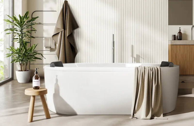
Popular Bathroom Styles and Tapware Pairings
Here’s how to pair tapware with common bathroom styles for a cohesive look:
-
Modern Minimalist: Sleek, clean lines with chrome or matte black tapware, white or grey tiles, and simple vanities.
-
Scandinavian: Light timber vanities, neutral tiles, and brushed nickel or matte black taps.
-
Classic Elegance: Polished brass or gold taps, marble benchtops, and traditional cabinetry.
-
Industrial: Matte black or gunmetal taps with raw or textured surfaces like concrete-look tiles and timber vanities.
Check out Burdens Bathrooms’ shower and tapware collections to match your preferred style.
Finishing Touches for a Cohesive Look
Even after selecting your tapware and surfaces, small finishing touches can enhance cohesion:
-
Accessories: Soap dispensers, towel rails, and mirrors in the same finish as your tapware reinforce a unified style.
-
Lighting: The right lighting highlights your finishes and textures. Warm lighting complements brass or gold, while cooler lighting suits chrome or black fixtures.
-
Wall Colours: Neutral walls allow tapware and surfaces to shine, while bold walls can create contrast if your tapware is more subtle.
Explore Burdens Bathrooms’ bathroom accessories for pieces that complete your coordinated look.
Tips for Achieving Balance
-
Plan Before You Buy: Visualise your space and create mood boards combining tapware, tiles, and vanities.
-
Stick to 2-3 Finishes: Too many finishes can make the space feel busy.
-
Test Samples: Bring tapware and surface samples together to see how they interact in different lighting.
-
Consider Maintenance: Matte finishes and brushed metals hide water spots and fingerprints better than polished finishes.
-
Trust Your Style: Cohesion doesn’t mean uniformity—balance bold choices with neutral elements for harmony.
Conclusion
Coordinating tapware and surfaces is an art that combines aesthetics, functionality, and personal style. By considering finishes, textures, and proportions, you can create a bathroom that feels polished, cohesive, and timeless. Whether you prefer modern minimalism, classic elegance, or bold contrasts, Burdens Bathrooms’ extensive tapware, vanities, tiles, and accessories collections provide everything you need to achieve your dream bathroom.
For more inspiration on bathroom design and trends, explore the Burdens Bathrooms blog and discover expert tips to guide your renovation journey.